

Data Storytelling: How to Turn Data into Insights, Visuals, and Business Decisions
This article will explore the Art and Science of data storytelling by its tools, best practices, and how this technique can be applied in various contexts.
Data Storytelling in 2026
Data storytelling is a technique that combines data analysis with narrative to transform numbers and information into engaging stories. In a world where the volume of data is growing exponentially, the ability to communicate insights clearly and persuasively becomes a competitive advantage.
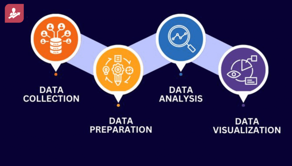
The usual path of telling a story is gathering the data and getting insights about the data and showing it as a visual.
Data → Insights → Visual Actions
Effective communication of data is essential not only for understanding but also for decision-making. A skilled data storyteller does not just present data; they contextualize it, allowing the audience to grasp not only the “what” of the data but also the “why” and “how.” This skill is particularly important in corporate environments, where well-informed decisions can significantly impact outcomes.
- AI-assisted data analysis
- Interactive dashboards
- Real-time data
- Natural-language queries
- Automated insights
- Predictive analytics
- AI-generated charts and summaries
- Business intelligence tools such as Power BI and Tableau
You can explain that modern data storytelling is no longer only about creating charts. It is about helping people understand data, find the important insight, and take action quickly.
Data → Insight → Story → Action
Data → Insights → Visual Actions
A more useful modern framework would be:
Data → Analysis → Insight → Story → Visualization → Action
Explain each step:
- Data: Collect relevant and reliable data.
- Analysis: Find patterns, trends, and unusual changes.
- Insight: Identify what the data is actually telling us.
- Story: Explain why the insight matters.
- Visualization: Use the right chart or dashboard.
- Action: Recommend what the business should do next.
Role of AI in Data Storytelling
AI can now help data professionals:
- Find patterns in large datasets
- Generate initial summaries
- Identify unusual changes
- Suggest suitable charts
- Ask questions using natural language
- Create automated reports
- Generate business insights
- Support predictive analysis
However, AI-generated insights should still be checked and validated by a data professional before being presented to decision-makers.
Modern Data Storytelling Tools
|
Tool |
Common Use |
|
Power BI |
Interactive dashboards and business reporting |
|
Tableau |
Data visualization and analytics |
|
Excel |
Data analysis and simple dashboards |
|
Python |
Data analysis, automation, and advanced visualization |
|
Google Looker Studio |
Web-based reporting and dashboards |
|
Canva |
Presentations and visual storytelling |
|
ChatGPT/AI tools |
Data exploration, summaries, and idea generation |
Choosing the Right Chart
- Line chart → Show trends over time
- Bar chart → Compare categories
- Pie/donut chart → Show simple proportions
- Scatter plot → Show relationships between variables
- Heatmap → Show patterns and concentration
- Map → Show geographical information
- Funnel chart → Show stages in a process
- KPI cards → Highlight important numbers
more charts do not mean better storytelling. The visualization should support the main message.
Data Storytelling for Different Audiences
For executives:
Focus on business impact, KPIs, risks, opportunities, and recommendations.
For managers:
Focus on performance, trends, problems, and actions.
For technical teams:
Include methodology, data quality, statistical analysis, and technical details.
For customers or the public:
Use simple language, clear visuals, and relatable examples.
Data Storytelling vs Data Visualization
|
Data Visualization |
Data Storytelling |
|
Focuses on presenting data |
Focuses on explaining data |
|
Mainly uses charts and graphs |
Combines data, visuals, and narrative |
|
Shows what happened |
Explains what happened and why it matters |
|
Can be exploratory |
Usually has a clear message |
|
May contain many charts |
Uses only relevant visuals |
|
Does not always recommend action |
Often leads to a decision or action |
Fundamentals of Data Storytelling
At the core of data storytelling is the idea that raw data is insufficient; it must be contextualized. Narrative helps make sense of these data, creating an arc that includes an introduction, development, and conclusion.
The introduction presents the context and the question to be answered. The development involves analyzing the data that supports the narrative, while the conclusion offers insights and recommendations based on the analysis.
Understanding the audience is crucial. Different audiences have varying levels of understanding regarding data and its applications. For instance, a presentation for executives may require a different level of detail compared to one for a technical team. Therefore, the narrative should be tailored to ensure that insights are accessible and relevant, using appropriate language and examples that resonate with the audience.
Additionally, the narrative should connect emotionally with the audience. Incorporating elements that touch the audience, such as personal stories or analogies, can enhance the impact of the message. This is especially important in contexts where data may seem cold or impersonal.
Tools and Techniques involved In Data Based Story Telling
One of the primary tools of data storytelling is Data visualization. Visualization is a critical component, as it facilitates the understanding of complex information. Tools such as Tableau and Power BI enable the creation of interactive graphs, maps, and dashboards that help effectively communicate insights.
The choice of the right visualization can make a significant difference in how data is interpreted. Trend graphs, for example, are useful for showing how data evolves over time, while heat maps can identify areas of concentration and geographical patterns. Infographics combine text, images, and data, making it easier to absorb complex information.
Statistical analysis is also fundamental for transforming data into meaningful insights.
Techniques such as :
-
- Regression,
-
- Hypothesis testing
-
- Multivariate analysis
These help identify correlations and causal relationships. Understanding these techniques is essential for supporting the narrative with robust quantitative evidence.
Statistical analysis not only provides credibility to the narrative but also enables the storyteller to make predictions based on historical data, helping to anticipate future trends.
In addition to visualization tools, it is important to consider software like Adobe Spark or Canva for creating engaging presentations. The narrative can be even more effective when using storytelling frameworks, such as the three-act structure. This model, which includes an introduction, development, and conclusion, can guide the creation of the narrative and ensure that the message is clear and coherent.
Strategies for Crafting an Effective Data Story
Preparation is the first step in building an effective data story. Defining the objective is crucial; you need to identify the central question you wish to answer. Next, it is necessary to gather relevant data, ensuring it is clean and consistent. Inconsistent data can compromise the quality of the analysis and, consequently, the narrative.
Once the data is collected, the analysis phase begins. Data exploration should be conducted using descriptive analysis techniques to understand patterns and trends. This may involve creating simple graphs to visualize data distribution or identifying outliers that may affect results. After this initial exploration, it is time to apply modeling techniques, using statistical methods or machine learning to make predictions and identify more complex relationships between variables.
With the data analyzed, the next step is to create the narrative. Contextualization is key; it is essential to present the scenario that led to the data collection. The narrative should then develop the data through visualizations that support the argument, and the conclusion should offer clear insights based on the analysis, along with practical recommendations.
Best Practices
Clarity and simplicity are essential in a data story. It is important to use straightforward language and avoid technical jargon that may confuse the audience. Visualizations should also be intuitive, avoiding overwhelming the audience with unnecessary information. Each graph or table should have a clear purpose and contribute to the overall narrative.
Coherence is another important characteristic to consider. The narrative should follow a logical flow, with smooth transitions between sections. This helps the audience follow the reasoning and understand how the different parts of the story connect. Additionally, using transition phrases that link ideas and highlight key points along the way can be helpful.
Finally, emotionally engaging the audience can enhance the impact of the narrative. This can be achieved by including personal stories, testimonials, or concrete examples that make the data more tangible and relevant. When data is presented in a context that resonates emotionally, the audience is more likely to remember the information and consider it when making decisions.
Case Studies
Case-1
A clear example of data storytelling in the marketing realm can be found in an e-commerce company that used this technique to demonstrate the effectiveness of its advertising campaigns. Through a visual presentation that showed sales data before and after a specific campaign, they were able to clearly illustrate the positive impact of their strategy. The use of interactive graphs that allowed detailed exploration of the data increased audience engagement and acceptance of new products.
Case-2
In the field of public health, during the COVID-19 pandemic, various health agencies utilized data storytelling to communicate the evolution of the situation. Interactive graphs and visual narratives helped inform the public about the seriousness of the pandemic, the importance of protective measures, and public health guidelines.
This approach not only conveyed crucial information but also encouraged behaviors that saved lives, demonstrating the power of narrative in mobilizing social actions.
Conclusion
Data storytelling is a vital skill for professionals who wish to communicate insights effectively. By uniting data and narrative, it is possible to transform complex information into engaging stories that not only inform but also inspire action. Understanding the available tools and techniques, as well as applying best practices, is essential for standing out in this ever-evolving field.
The art of telling stories with data is more than just a technique; it is a powerful way to influence decisions and shape perceptions. In a world saturated with information, those who master the ability to tell stories with data position themselves ahead, capable of impacting their audiences and facilitating deeper understanding. Therefore, investing time and effort into developing data storytelling skills can be one of the most important steps in the career trajectory of any data professional.
FAQ’s
What is data storytelling?
Data storytelling is the practice of combining data analysis, narrative, and visualization to communicate insights in a way that is clear, engaging, and actionable. It transforms raw numbers into stories that explain what is happening, why it matters, and what should be done next. Participants in data analytics training in Hyderabad will teach you to apply these technique in real-world datasets.
Why is data storytelling important for decision-making?
Data storytelling bridges complex data with actionable insights, helping professionals influence decisions. WhiteScholars data analyst course in Hyderabad curricula. It builds trust through clear narratives, enabling faster business outcomes, which is emphasized in data analytics coaching. This skill gives a competitive edge in corporate roles.
What are the main components of a data story?
A strong data story typically includes three core components: accurate data, a clear narrative, and effective visualizations. Together, these elements guide the audience from context and problem, through analysis, to insights and recommended actions.
Which tools are commonly used for data storytelling?
Tools like Tableau and Power BI dominate data storytelling training in WhiteScholars data analytics coaching in Hyderabad, enabling interactive dashboards. Designers also use tools such as Canva and similar platforms to create visually appealing presentations and infographics around the data narrative.
What are some best practices for effective data storytelling?
Key best practices include tailoring the story to the audience, using simple and clear language, and choosing visualizations that directly support the main message. It is also important to maintain a logical narrative flow and, when appropriate, add emotional or real-world context so the story is memorable and drives action.
