

How to Get Started With Excel for Data Analysis: A Beginner-Friendly Guide
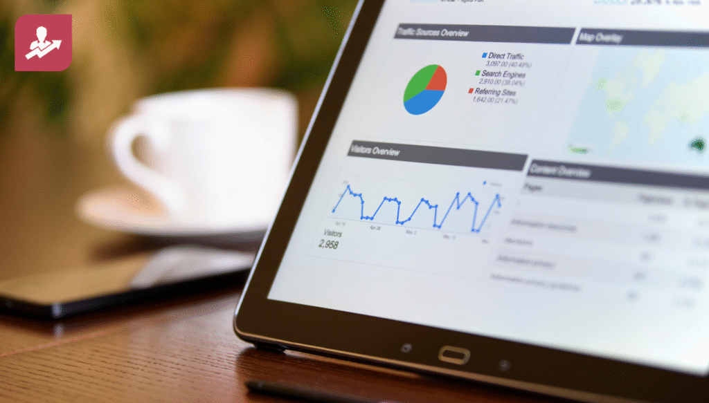
Table of Contents
Learn how to start using Excel for data analysis with simple steps, practical examples, and real-world tips. Perfect for beginners exploring analytics or preparing for a data analytics course in Hyderabad.
Introduction
As our society becomes increasingly reliant on data, we must explore various data analysis tools available to us. While there may be many different choices out there, Microsoft Excel is still the most commonly used data analysis tool around.
Whether you’re a student, a professional seeking to develop new career skills, or someone looking to change careers altogether, Microsoft Excel will provide? a gentle introduction to how to analyse data, identify patterns or trends, and use numbers to make informed decisions.
For those of you located in Hyderabad or considering pursuing a Data Analytics course in Hyderabad, becoming proficient in Microsoft Excel before you start working with larger amounts of data could set you up for success in the future in roles where you’ll be responsible for managing larger quantities of data.
In this article we’ll explore why Excel matters, how to get started, fundamental techniques, how to build confidence with real projects, and how Excel fits into a broader path toward data analytics. We’ll also look at where you can learn more especially around Hyderabad and end with what kind of images you can use to make your article or blog more engaging.
Why Excel Is Still a Key Tool for Data Analysis
Excel’s widespread adoption and ease
Despite more advanced analytics tools continuously emerging, Excel remains nearly universal in businesses around the world. Many organizations still rely on Excel for data cleaning, management, reporting and basic analysis. According to a recent survey of data analysts, around 65% say they use Excel for their daily tasks.
Other data analysis tools like SQL, Python, and BI platforms are growing, but Excel’s low learning curve and wide support make it ideal for anyone starting out. For example, even among job postings for data analytics, more than 40–50% list Excel as an essential skill.
Growing demand for data analytics and Excel’s role
Globally and in India, demand for data analytics professionals is rising fast. In recent years, the share of job postings requiring data analytics skills in India has surged. One report shows that nearly 17.4% of all job postings in India during a recent period sought analytics/data skills.
This growth reflects a broader trend: as companies accumulate more data via e-commerce, finance, healthcare, manufacturing, and more they need people who can handle data, clean it, analyze it, and derive insights. Even if advanced tools are used for heavy-lift analytics, Excel often remains the go-to for quick analysis, sanity checks, and reports.
For individuals in Hyderabad (or any city with a strong IT/analytics scene), building Excel skills can therefore open doors. Many who begin with Excel later move on to more advanced analytics tools. If you plan to enroll in a data analyst course in Hyderabad or a data analytics course in Hyderabad, proficiency in Excel can give you a headstart.
Getting Started: Basic Excel Skills for Data Analysis
Here’s a roadmap to getting started with Excel from zero to useful.
1. Set up Excel and understand the interface
- Install Excel (or use the online/Office 365 version) and launch a blank workbook.
- Familiarize yourself with the Ribbon menu: Home, Insert, Data, Formulas, and View these hold most of the features you’ll need.
- Understand basic concepts: workbooks (files), worksheets (tabs), cells (the boxes), rows and columns, and ranges (a block of cells).
- Practice simple navigation: selecting cells/rows/columns, copying/pasting, and inserting/deleting rows or columns.
Spend some time exploring; that familiarity will pay off when you start working with data.
2. Enter and organize data properly
- Input data in tabular form: every column should represent one variable (e.g. date, sales amount, product name), and every row one record (e.g. one sale, one customer, one survey response).
- Use clear headers. For example, “Date,” “Product_ID,” “Sales_Amount,” and “Region.”
- Avoid merging cells for data entries (merging is often fine for headers or presentation but trouble for data manipulations).
- Keep data “clean”: avoid blank rows/columns, avoid combining multiple types of info in one cell (e.g. “John, Sales”).
Proper organization makes analysis easier later (sorting, filtering, formulas, pivoting).
3. Learn basic formulas and functions
Excel’s power comes from formulas; these let you compute metrics, clean data, and derive insights. Some essential ones to begin with:
- Arithmetic formulas: =A2 + B2, =C2 * D2, etc.
- Sum: =SUM(range) — to add up a column of numbers.
- Average: =AVERAGE(range) — to compute mean values.
- Count / Count non-blank: =COUNT(range) or =COUNTA(range).
- Min / Max: =MIN(range), =MAX(range) — useful to find extremes.
- IF logic: =IF(condition, value_if_true, value_if_false) — helps classify or filter data (e.g. marking high vs low sales).
- Date functions: =TODAY(), =YEAR(date), =MONTH(date), to extract or work with dates.
- Text functions: =TRIM(), =LEFT(), =RIGHT(), =CONCATENATE() — helpful if cleaning messy data.
Start with simple datasets (sales, inventory, survey results), and apply these formulas to compute totals, averages, counts, etc.
4. Sort, filter, and clean data
Before you dive into deeper analysis, ensure your data is clean and easy to work with:
- Use Sort (Data → Sort) to order rows based on a column (e.g. by date, sales, alphabetically by name).
- Use Filter (Data → Filter) to display only rows that meet certain conditions (e.g. sales > X, region = “South”).
- Use Find & Replace (Ctrl+F / Ctrl+H) to clean text, standardize naming (e.g. “NY” vs “New York”).
- Detect duplicates (Data → Remove Duplicates) when working with lists where uniqueness matters.
These steps help reduce errors and make working with clean data easier when you move to analysis or visualization.
Deeper Excel Techniques for Data Analysis
Once you’re comfortable with basics, these features help move from raw data to insights.
5. Use Pivot Tables for summarization
Pivot tables are among Excel’s most powerful features for data analysis. With a pivot table you can:
- Summarize large datasets quickly (e.g. total sales by region, by product, by month).
- Group data by categories (e.g. by product category, by customer type) and compute summary metrics (sum, count, average).
- Pivot the orientation: swap rows and columns to change perspectives.
- Drill down into details: many pivot tables allow you to double-click a summary cell to see the raw records behind it.
Working with pivot tables helps you identify trends, patterns, and insights without writing complex formulas.
6. Use charts and basic visualization
Once you have summarized data (for example via pivot tables), visualizing it helps communicate insights clearly. Excel supports many chart types:
- Column / Bar charts for comparing categories.
- Line charts are good for time-series data (e.g. sales over months).
- Pie charts for showing proportions (e.g. market share by region).
- Scatter plots useful when comparing two numerical variables (e.g. advertising spend vs sales).
Add axis labels, titles, and legends make sure your chart is clear, not cluttered. Visualization helps reveal patterns that might be hidden in raw tables.
7. Use features for data cleaning and quality control
Real-world data is messy. Excel provides tools that help:
- Conditional formatting: highlight cells based on conditions e.g. highlight negative values, highlight high sales, and mark dates older than a threshold.
- Data validation: restrict inputs in cells (e.g., dropdown lists, only numbers, only dates) to minimize data entry errors.
- Text-to-columns: split one column into multiple based on delimiter (e.g., splitting “First Last” into two columns).
- Remove duplicates, find/replace, trim spaces, and standardize casing as earlier mentioned.
These tools are essential when working with imported data (e.g., CSV exports, survey responses, log files), preparing it for analysis.
8. Use Excel to prepare data for export/further analysis
Often, Excel serves as a staging ground. You can clean and structure data in Excel, then export to CSV for use in other tools (SQL, Python, Power BI, etc.). Many analysts do preliminary cleaning and exploratory analysis in Excel before moving to heavier analysis or dashboarding tools.
This approach “Excel for prep, another tool for deeper analysis” helps speed up workflows while ensuring accuracy.
Building Confidence: Projects & Practice
9. Start with small real-world datasets
One of the best ways to learn Excel is by working on real data. Some ideas:
- Sales data for a small business: product, date, quantity sold, and price analyze monthly sales, top products, and region-wise sales.
- Customer survey data: ratings, feedback categories, customer demographics get summary statistics, pivot by demographics, and visualize satisfaction levels.
- Personal finance tracker: income, expense, category, and month analyze spending patterns, monthly expense vs. income, and savings trends.
- Public datasets: you can find free datasets (e.g. from government portals, open data initiatives, and Kaggle), import them into Excel and experiment.
By practicing on real data, you’ll learn not just Excel commands but also how to ask real questions, clean messy data, and draw actionable insights.
10. Document your process and findings treat it like a mini-report
Whenever you work on a dataset, treat it like a real business assignment:
- Maintain a “data” sheet (raw data), a “cleaned/processed” sheet, and an “analysis/summary” sheet.
- Use clear headers; use freeze panes to keep headers visible.
- Add a “readme” or notes sheet explaining the data source, cleaning steps, and assumptions.
- Summarize insights: which products are top sellers, what months have the highest sales, where revenue comes from, and what trends you see.
- Use charts and pivot tables to support your findings.
This practice not only helps you learn but also builds a portfolio useful when you later join a data analyst course in Hyderabad or apply for an analytics job.
Excel as a Launchpad The Bigger Data Analytics Journey
11. Excel plus other tools for more advanced analytics
Excel is often the first tool, but real-world data analytics roles increasingly involve more powerful tools. According to recent industry analysis, many job postings now expect familiarity with database querying (like SQL), scripting (Python or R), or business intelligence tools (like Power BI, Tableau).
But starting with Excel gives you a foundation: cleaning data, summarizing, understanding structure, and spotting outliers are all built upon when you move to other tools.
12. Why people choose a “data analyst course in Hyderabad / data analyst course Hyderabad”
If you are in Hyderabad (or nearby), many choose to enroll in local courses to build data analytics skills in a structured way. A good course can:
- Cover Excel fundamentals, advanced Excel (pivot tables, macros, and data cleaning), and introduce SQL, Python, and visualization tools.
- Provide practical, project-based learning with real datasets.
- Give certifications or credentials recognized by employers.
- Help you build a portfolio of cleaned datasets, dashboards, and reports which you can show in interviews.
Given the growing demand for analysts (India recently saw a sharp rise in analytics job postings), enrolling in a data analyst course in Hyderabad can make sense if you want a guided path rather than self-study.
Market Demand & Career Prospects Why This Path Makes Sense
- The analytics job market is expected to keep growing. Some sources predict a growth rate of 23–28% between 2021 and 2031 for data-analysis roles.
- In India, companies across sectors finance, e-commerce, healthcare, and IT services are hiring data analysts to make sense of large volumes of data.
- For freshers, typical salary ranges are often ₹4–6 LPA; with a few years of experience and added skills (SQL, visualization, domain knowledge), many reach ₹8–12 LPA or more.
- Locally, in Hyderabad, demand is strong. Many businesses, startups, and MNCs need analytics support. For someone starting with Excel and then upskilling via a data analyst course Hyderabad, there is a viable path to secure roles.
This makes learning Excel and related analytics tools a smart career move, especially if paired with structured learning.
Tips for Choosing or Enrolling in a Data Analyst Course (Especially in Hyderabad)
- Look for courses that cover Excel (beginner to advanced), data cleaning, pivot tables, data visualization, as well as database querying (SQL) and basic scripting (Python/R).
- Prefer courses with project-based learning real datasets, end-to-end analysis, and reports/dashboards.
- A curriculum combining technical skills (Excel, SQL, Python) + visualization (Power BI / Tableau) + soft skills (communication, presentation) gives better outcomes.
- Try to build a portfolio during or after the course — projects that show you can take raw data and deliver insights.
If you’re in Hyderabad, search for programs promoting “data analyst course in Hyderabad” or “data analyst course Hyderabad.” These local courses can offer mentorship, peer support, and possibly industry connections.
What Kind of Images to Use For a Blog Post or Article
To make this content more engaging and easier to understand, here are suggestions for images you might include:
- A screenshot of an Excel workbook showing raw data and a clean, organized table (for “data entry and organization” section).
- A screenshot of a pivot table and a corresponding chart (bar chart, line chart) to illustrate summarization and visualization.
- An infographic or chart showing the growth of data analytics jobs in India (or globally) over the past 5–10 years to support the “market demand” section.
- A flow diagram showing the path: Raw Data → Clean Data → Analysis (Pivot/Table/Formula) → Insights/Report to help readers visualize the workflow.
- Photos or illustrations of a person working on Excel on a laptop to add human touch and context for newcomers.
Using such images helps readers understand not just the “how,” but the “why” and “what” of each step.
Conclusion
Starting with Excel is a practical and smart first step toward a career in data analysis. It helps you build essential habits: organizing data carefully, cleaning/massaging data, summarizing, visualizing, and interpreting outputs. Combined with growing demand for data skills, especially in places like Hyderabad, Excel can be your stepping stone to more advanced analytics, dashboards, and even data science roles.
If you are serious about a career in analytics, consider pairing your practice with a structured data analyst course in Hyderabad. That route offers not just technical training but also project experience, mentorship, and clarity about where to go next.
With consistent practice and real-world projects, Excel can give you a strong foundation. From there, you can branch into SQL, Power BI, Python, or whatever tools your target job needs.