

Turning Data into Decisions: Statistics The True Backbone of Data Analytics
This article will be highlighting the issues related to Statistics which is important in data analysis, where to use statistical concepts in the field of data analytics and how statistics helps turn data into decisions.
What is Statistics?
Statistics is the science of conducting studies to collect, organize, summarize, analyze, and draw conclusions from data.
In simple words, by dealing with data, we need many methods to organize the data and know the measures related to the data. Summarize the data, know the frequency distribution, how far apart the data are from each other, etc.
Statistics helps us to organize the data and know its basic characteristics, in addition to analyzing and summarizing it, in order to finally reach a decision that helps us understand the data and take the right actions.
What statistics means in data analytics
Statistics in data analytics refers to the mathematical discipline of collecting, organizing, analyzing, interpreting, and presenting data to uncover patterns, trends, and actionable insights from raw datasets.
It serves as the foundational backbone for transforming large volumes of information into meaningful summaries and predictions, enabling data professionals to make evidence-based decisions in fields like business, healthcare, and marketing
Without statistics, a data analyst is just plotting charts without really knowing whether the conclusions are valid or reliable.
Descriptive statistics: mean, median, mode
Descriptive statistics summarize large datasets using simple numbers like mean, median, mode, minimum, maximum, and standard deviation.
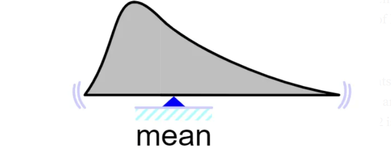
What is a Mean?
When we have a set of numerical data like this (4, 5, 6, 7, 10), each value in the set of data is referred to as a data point. We might want to find the data’s average value.
- So, mean is essentially the average of a set of data and is calculated as the sum of all the data points divided by the total number of data points.
- Mean is only used on numerical data. Finding the average of our category data is impractical.
What is a Median?
Also, given a group of values, we may want to discover the value in the center. The median is used to compute the value in the middle. Median also is used on numerical data only.
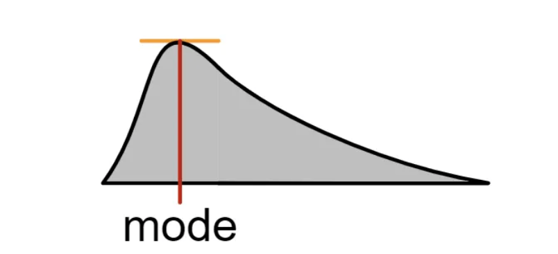
What is a Mode?
This is the value with the highest frequency (that is a value that has the highest number of occurrences). The mode can be used for numerical or categorical data.
In real‑world data analytics projects taught in WhiteScholars data analyst course in Hyderabad, you frequently start with descriptive statistics to understand customer age, purchase amounts, website session duration, or loan sizes before moving to deeper modeling. These summaries are also the basis for dashboards, KPI reports, and management presentations that you will build after completing a data analytics course in Hyderabad.
Variability and spread: variance and standard deviation
Knowing the average is not enough; you also need to know how spread out the data is. Variance and standard deviation measure how far individual data points are from the mean and help you understand risk, volatility, and consistency.
The standard deviation is an extremely valuable summary that informs us that we have some outliers in our dataset.
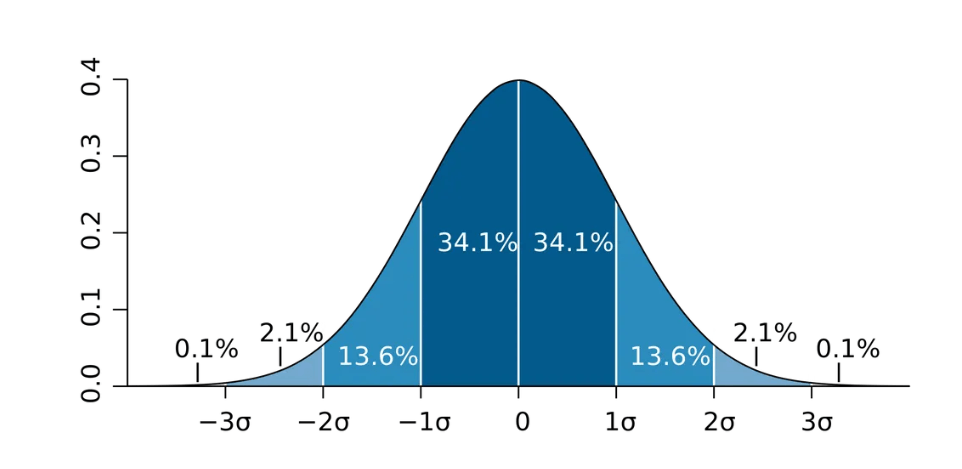
In the above chart, we see a Normal Distribution. 34.1% + 34.1% = 68.2% of all observations are within one standard deviation, or 1σ variance
Data cleaning, outliers, and robust analysis
Statistics is also vital for data cleaning like detecting errors, missing values, and outliers that can mislead analysis. Using statistical rules and visualizations, analysts can identify unrealistic values, inconsistent categories, or measurement mistakes and decide whether to correct, transform, or remove them.
This statistical awareness helps you build models that are robust, fair, and more generalizable to new data.
Visualization and communication of insights
Good statistics supports clear data visualization, turning complex patterns into simple, accurate charts and dashboards. Measures like mean, median, quartiles, and correlation coefficients sit behind boxplots, histograms, scatterplots, and heatmaps that decision‑makers rely on.
WhiteScholars data analyst course in Hyderabad will emphasize not only how to calculate these measures but also how to present them in a way that non‑technical stakeholders can understand.
This blend of statistical rigor and communication skill increases your value as a data analyst and is often highlighted in job‑oriented data analytics training in Hyderabad.
What is a Bar Chart?
A bar chart is a type of data visualization used for categorical data.where the length or height of each bar shows the value or frequency for that category, making it easy to see patterns, trends, and relative sizes at a glance
What is a Histogram?
A histogram is similar to a bar chart in that it shows the frequency of your numerical data called height, but it groups the numerical data points into bins or ranges.
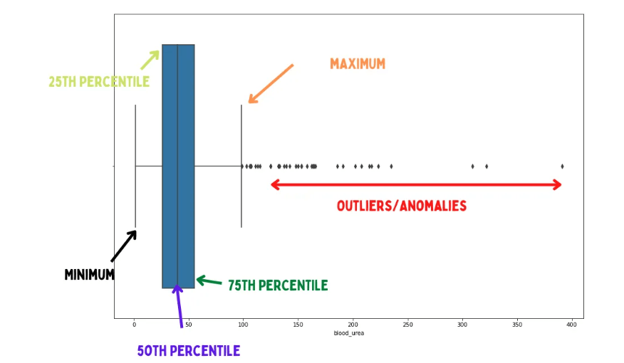
What is a Boxplot?
Another excellent visualization that helps you visualize the distribution of your data is the boxplot.
A boxplot, for example, allows you to visually observe if there are any outliers in your data collection. It includes terms such as minimum, 25th percentile, 50th percentile, 75th percentile, and maximum.
A Boxplot looks as follows:
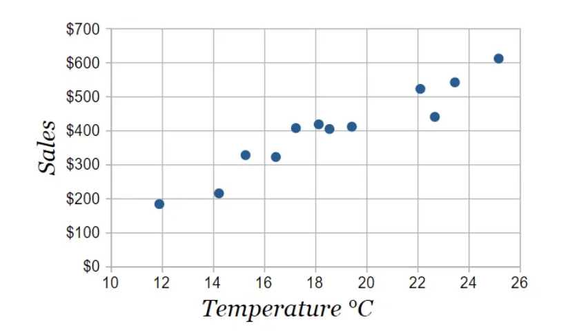
What is a Scatter Plot?
We can represent the correlation between quantitative variables in a graphical summary by using a plot called a scatter plot.
A scatter plot looks like this:
Basic data visualization and provide enterprises with information-driven, targeted data. Advanced mathematics in statistics tightens this process and cultivates concrete conclusions.
Why statistics boosts your data analytics career
In the modern job market, companies expect data analysts to go beyond basic reporting and deliver statistically sound insights that reduce risk and drive growth. Recruiters often list knowledge of descriptive statistics, probability, regression, and hypothesis testing as mandatory skills for analytics and data science roles.
Enrolling in a comprehensive data analytics course in Hyderabad or a specialized data analyst course in Hyderabad helps you systematically build these statistical skills through practical projects and case studies.
Such data analytics training in Hyderabad typically combines statistics with tools like Excel, SQL, Python, and visualization platforms, preparing you for roles in marketing analytics, finance, operations, and product analytics.
Choose WhiteScholars Data Analytics course that covers core statistics
The WhiteScholars data analyst course in Hyderabad has an Optimal curriculum that includes:
- Descriptive statistics: mean, median, mode, variance, standard deviation, percentiles, and basic distributions.
- Probability and inferential statistics: sampling, confidence intervals, hypothesis testing, and p‑values.
- Regression and correlation: simple and multiple regression, correlation analysis, and model evaluation metrics.
- Applications in real projects: A/B testing, forecasting, customer segmentation, and business dashboards.
WhiteScholars data analytics training in blends these topics with real datasets will not only improve your problem‑solving ability but also enhance your profile for employers searching for job‑ready analysts. effectively in real business environments.
Conclusion and Learning More
In this tutorial, we’ve explored some fundamental statistics concepts that will help you work more efficiently with your data.
But the learning does not stop here; there are a few fundamental topics that you must be familiar with. Because this is only the beginning, you can delve deeper
FAQ’s
What is the definition of statistics in data analytics?
Statistics in data analytics is the discipline of collecting, organizing, analyzing, interpreting, and presenting data to uncover patterns, trends, and insights for informed decision-making. It forms the foundation for handling uncertainty and extracting meaningful information from raw datasets in analytics workflows.
How does descriptive statistics fit into data analytics?
Descriptive statistics summarizes datasets using measures like mean, median, variance, and standard deviation to provide a clear overview of data characteristics without making predictions.
In data analytics, it helps in initial data exploration and visualization, such as creating histograms or summary tables for stakeholder reports.
What role does inferential statistics play in data analytics?
Inferential statistics uses sample data to draw conclusions about larger populations through techniques like hypothesis testing, confidence intervals, and regression analysis. Data analysts apply it to validate trends, such as A/B test results or forecasting models, ensuring decisions are statistically sound.
Why is statistics essential for data cleaning and modeling?
Statistics identifies outliers, measures data variability, and tests relationships via correlation, enabling robust data cleaning and reliable predictive models in analytics. Without it, analysts risk drawing flawed insights from noisy or biased data, which is covered in data analytics courses in Hyderabad.
How does statistics support business decisions in data analytics?
Statistics quantifies uncertainty with probability distributions and p-values, helping analysts predict outcomes like customer churn or sales trends for strategic actions. Mastering these concepts through a data analyst course in Hyderabad equips professionals to communicate insights via dashboards and reports effectively.