

Build a Netflix Power BI Dashboard from Scratch Using a Real-World Dataset

Introduction
This netflix project demonstrates how to build a professional and interactive Netflix Power BI dashboard using a real-world dataset. Let’s learn to clean and transform data, create calculated columns and measures, and build interactive visualizations using Power BI DAX functions.
Throughout the tutorial, let’s explore essential DAX functions in Power BI, including SUMX Power BI, LOOKUPVALUE Power BI, and DATEADD Power BI, while learning how DAX formulas Power BI are used to calculate key business metrics. If you are looking for DAX functions in Power BI with examples or a practical Power BI DAX functions list, this project will help you build a portfolio-ready dashboard and strengthen your Power BI skills.
Key Takeaways
- Import and prepare a real-world dataset in Power BI.
- Clean and transform data using Power Query.
- Create KPI cards using Power BI DAX functions and DAX formulas.
- Build interactive charts, treemaps, and slicers.
- Design a professional Netflix dashboard suitable for portfolios and interviews.
- Apply best practices for dashboard formatting and visualization.
Projects like this help build practical Power BI skills and strengthen your portfolio for data analytics roles. For more hands-on Power BI, Data Analytics, and AI projects, continue exploring learning resources and guided tutorials of Data Analytics Course in Hyderabad from WhiteScholars to keep enhancing your industry-ready skills.
Prerequisites
Before getting started, ensure that Power BI Desktop is installed and the Netflix dataset has been downloaded. A basic understanding of DAX functions in Power BI and Power BI visuals will help you follow this tutorial more easily, though beginners can also learn by following each step.
Download the Netflix Dataset
The dashboard in this tutorial is built using the Netflix Movies and TV Shows dataset from Kaggle by Shivam Bansal. This real-world dataset includes information such as movie and TV show titles, genres, ratings, countries, release years, and more.
Download the dataset from Kaggle and save it to your local system before proceeding. Once downloaded, you’ll be ready to import it into Power BI and start building the dashboard.
Import the Dataset into Power BI
After downloading the dataset, import it into Power BI Desktop to begin the dashboard creation process.
Follow these steps:
- Open Power BI Desktop.
- Click Home → Get Data → Text/CSV.
- Browse and select the downloaded Netflix dataset.
- Click Load to import the data.
Once the dataset is loaded, it will appear in the Fields pane and is ready for data cleaning, transformation, and analysis.
Tip: Before creating visuals, verify that columns such as Date Added and Release Year have the correct data types to ensure accurate reporting and calculations.
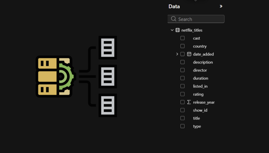
Clean & Transform the Data Using Power Query
Before creating the dashboard, clean and prepare the dataset using Power Query. Verify that all columns have the correct data types, remove any blank or unnecessary records, and ensure Date Added is set to Date and Release Year to Whole Number. Once the transformations are complete, click Close & Apply to load the cleaned dataset into Power BI and begin building the dashboard.
Create the KPI Cards
KPI (Key Performance Indicator) cards provide a quick overview of the most important metrics in a dashboard. In this Netflix dashboard, you’ll create six KPI cards to display Total Titles, Total Ratings, Total Genres, Start Date, End Date, and Total Countries. These metrics are calculated using Power BI DAX functions and DAX formulas in Power BI, making them dynamic and responsive to slicers and filters.
The following sections explain how to create each KPI card individually, including the required DAX formula and formatting steps.
- KPI 1: Total Titles
- KPI 2: Total Ratings
- KPI 3: Total Genres
- KPI 4: Start Date
- KPI 5: End Date
- KPI 6: Total Countries

KPI 1: Total Titles
The Total Titles KPI displays the total number of movies and TV shows available in the Netflix dataset. It provides a quick overview of the overall content library.
DAX Formula
- Total Titles = COUNTROWS(‘netflix_titles’)
Steps to Create the KPI Card
- Go to the Visualizations pane and select the Card visual.
- Click Modeling → New Measure and enter the above DAX formula.
- Drag the Total Titles measure into the Card visual.
- Format the card with a black background, white title, and red data label to match the dashboard theme.
KPI 2: Total Ratings
The Total Ratings KPI shows the total number of unique content ratings available in the dataset.
DAX Formula
- Total Ratings = DISTINCTCOUNT(‘netflix_titles'[rating])
Steps to Create the KPI Card
- Create a new measure using Modeling → New Measure.
- Enter the above DAX formula.
- Add the measure to a Card visual.
- Apply the same formatting as the previous KPI card.
KPI 3: Total Genres
The Total Genres KPI displays the total number of unique genres present in the dataset.
DAX Formula
- Total Genres = DISTINCTCOUNT(‘netflix_titles'[listed_in])
Steps to Create the KPI Card
- Create a new measure.
- Paste the DAX formula.
- Add the measure to a Card visual.
- Format the card to match the dashboard design.
KPI 4: Start Date
The Start Date KPI displays the earliest release year available in the Netflix dataset.
DAX Formula
- Start Date = MIN(‘netflix_titles'[release_year])
Steps to Create the KPI Card
- Create a new measure.
- Enter the DAX formula.
- Add it to a Card visual.
- Apply consistent formatting.
KPI 5: End Date
The End Date KPI displays the latest release year available in the dataset.
DAX Formula
- End Date = MAX(‘netflix_titles'[release_year])
Steps to Create the KPI Card
- Create a new measure.
- Enter the DAX formula.
- Add the measure to a Card visual.
- Format it to match the remaining KPI cards.
KPI 6: Total Countries
The Total Countries KPI shows the total number of unique countries represented in the Netflix dataset.
DAX Formula
- Total Countries = DISTINCTCOUNT(‘netflix_titles'[country])
Steps to Create the KPI Card
- Create a new measure.
- Enter the DAX formula.
- Add it to a Card visual.
- Use the same formatting as the other KPI cards for a consistent dashboard layout.
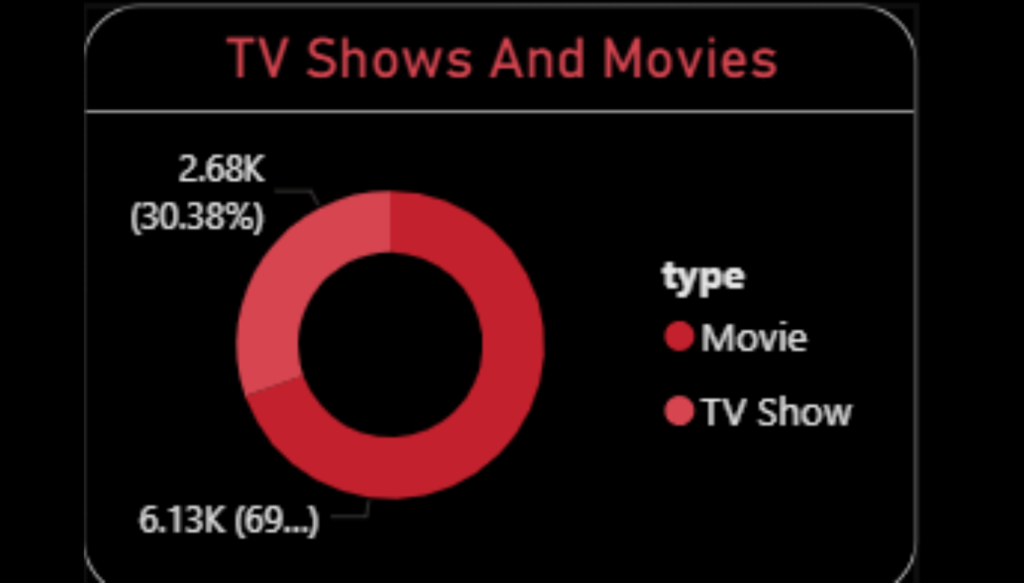
Create the Movies vs TV Shows Donut Chart
The Movies vs TV Shows donut chart compares the proportion of movies and TV shows available in the Netflix dataset, providing a quick overview of the content distribution.
Steps to Create the Donut Chart
- Select the Donut Chart visual.
- Drag Type to Legend.
- Drag Show ID to Values and set the aggregation to Count.
- Format the chart to match the dashboard theme.
The chart will automatically update based on the applied filters and slicers.
Create the Ratings by Total Titles Bar Chart
The Ratings by Total Titles bar chart displays the number of Netflix titles available under each content rating, such as TV-MA, TV-14, PG-13, and R. This visualization helps identify the most common content ratings in the dataset.
Steps to Create the Bar Chart
- Select the Clustered Bar Chart visual from the Visualizations pane.
- Drag the Rating column to the Y-axis.
- Drag the Show ID column to the X-axis and set the aggregation to Count.
- Sort the chart in descending order based on the total number of titles.
- Enable Data Labels and format the chart using the dashboard’s color theme.
The completed chart will provide a clear comparison of the number of titles available under each content rating, making it easy to identify the most popular rating categories in the Netflix dataset.
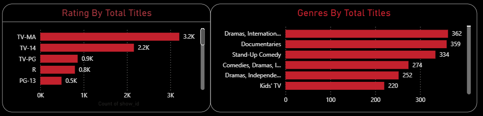
Create the Genres by Total Titles Bar Chart
The Genres by Total Titles bar chart highlights the most popular genres available in the Netflix dataset. It provides a clear comparison of the number of titles across different genres, helping identify the categories with the largest content library.
Steps to Create the Bar Chart
- Select the Clustered Bar Chart visual from the Visualizations pane.
- Drag the Listed In (Genre) column to the Y-axis.
- Drag the Show ID column to the X-axis and set the aggregation to Count.
- Sort the chart in descending order based on the total number of titles.
- Enable Data Labels and apply the same formatting as the other visuals to maintain a consistent dashboard design.
The completed chart will display the distribution of Netflix titles across different genres, making it easy to identify the most popular genres in the dataset.
Create the Top 10 Countries by Movies and TV Shows Treemap
The Top 10 Countries by Movies and TV Shows treemap highlights the countries with the highest number of Netflix titles. It provides a quick visual representation of content distribution across different countries.
Steps to Create the Treemap
- Select the Treemap visual from the Visualizations pane.
- Drag the Country column to the Group field.
- Drag the Show ID column to the Values field and set the aggregation to Count.
- Apply a Top N filter to display only the Top 10 countries based on the total number of titles.
- Enable Data Labels and format the treemap to match the dashboard theme.
The completed treemap will display the top 10 countries with the highest number of Netflix movies and TV shows.
Create the Movies & TV Shows by Release Year Area Chart
The Movies & TV Shows by Release Year area chart shows how Netflix content has evolved over time. It compares the number of movies and TV shows released each year, helping identify content trends across different periods.
Steps to Create the Area Chart
- Select the Area Chart visual from the Visualizations pane.
- Drag the Release Year column to the X-axis.
- Drag the Show ID column to the Y-axis and set the aggregation to Count.
- Drag the Type column to the Legend field to separate Movies and TV Shows.
- Format the chart by enabling data labels, adjusting the axis titles, and applying the dashboard’s color theme.
The completed area chart provides a clear year-wise comparison of movies and TV shows, making it easy to analyze Netflix’s content growth over time.
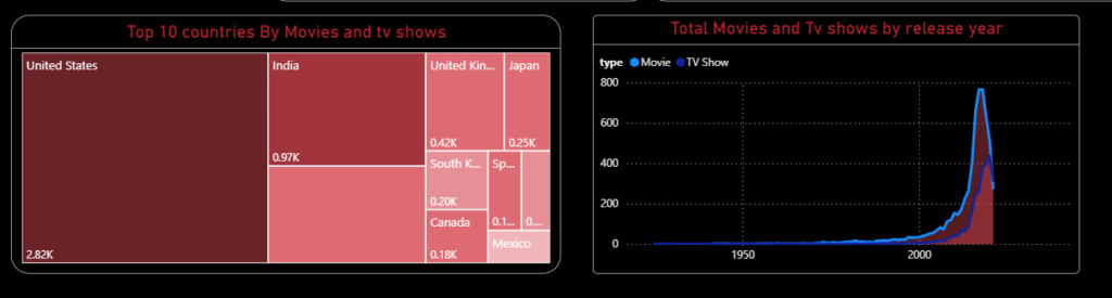
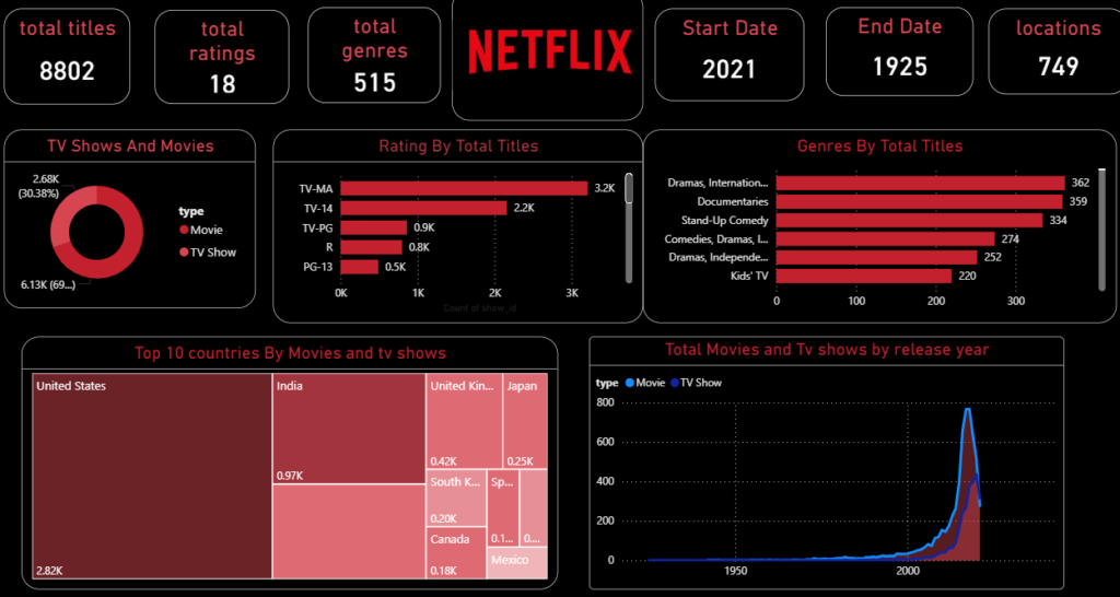
Final Dashboard
The completed dashboard provides a comprehensive overview of Netflix’s content library through interactive KPI cards, charts, and filters. It enables users to explore trends by content type, ratings, genres, countries, and release years, making it a practical example of real-world dashboard development in Power BI.
Conclusion
Building a Netflix Dashboard in Power BI is an excellent way to gain practical experience with real-world data analysis and visualization. Throughout this project, you’ve learned how to import and transform data using Power Query, create dynamic KPI cards with Power BI DAX functions, and design interactive charts that deliver meaningful business insights.
Projects like this not only strengthen your Power BI skills but also help you build an impressive portfolio for data analytics and business intelligence roles. To continue your learning journey with more hands-on Power BI, Data Analytics, and AI projects, explore the practical training and guided tutorials offered by WhiteScholars and keep developing industry-ready skills.
Frequently Asked Questions (FAQs)
1. Is this Netflix dataset suitable for beginners?
Yes. The dataset is beginner-friendly and is widely used to practice Power BI dashboard creation and data visualization.
2. Which Power BI features are covered in this project?
This project covers Power Query, KPI cards, interactive charts, slicers, dashboard formatting, and DAX functions in Power BI.
3. Are DAX formulas required to build this dashboard?
Yes. Basic DAX formulas in Power BI are used to create dynamic KPI cards and perform calculations.
4. Can this dashboard be added to a portfolio?
Absolutely. This project demonstrates practical Power BI skills and is a valuable addition to a data analyst or business intelligence portfolio.
5. Where can similar Power BI projects be found?
Hands-on projects and guided tutorials are one of the best ways to improve Power BI skills and build a strong portfolio.
